|
Scatter Charts |


|
A Scatter Chart may sometimes also be referred to as a Scatter Plot. This chart type is incredibly useful for visually investigating trends and relationships among two variables in your data. To better demonstrate the use of a Scatter Chart, let's consider an example.
A world-wide bike parts company wants to prepare a new marketing campaign for next fiscal quarter. They have a large amount of data on their customer base and want to find out specifically which age groups and gender are spending the most money per sale and focus their marketing efforts on that segment of the customer base. The simple question is then presented to you as a dashboard designer: how can you create a widget to display trends or relationships between age and average sale amount by gender.
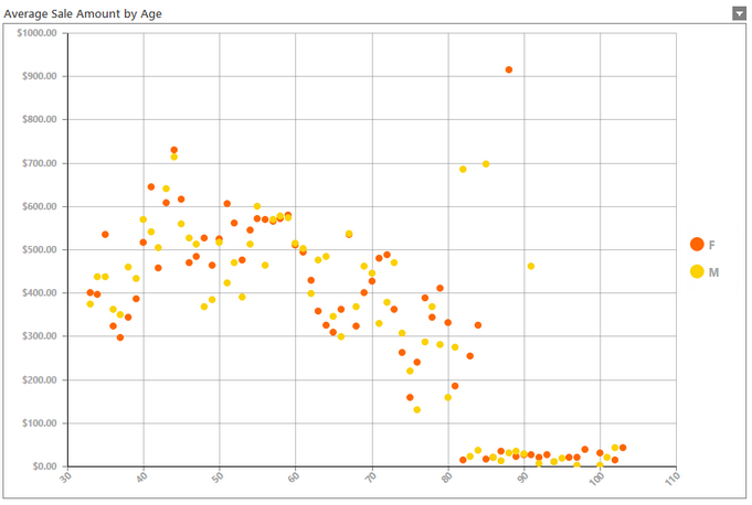
A Scatter Plot is useful for just this type of analysis requiring to plot each data point in relation to their two key values (X and Y respectively) and look for powerful trends, outliers, groupings, and more. The Scatter Chart below demonstrates the inclusion of such a chart to provide a visual tool for any dashboard user to investigate such relationships. In Figure 1, you can notice some trends in the data, such as the following:
| • | Average sales tend to drop between the ages 40 and 80. |
| • | Interesting outliers seem to be present that may require further investigation such as the high average sale amount for 88 year old females which may not be worth consideration for campaign design. |
In this section, we will review how this chart was created to help you insert your own Scatter Chart into your dashboard.

Figure1: A Scatter Plot shows valuable relationships amongst two data identifiers.
Access
To learn how to access the Insert Chart dialog please visit the helpful page on Inserting Visualization Widgets for the specific display mode you are using, Mouse or Touch.
Usage
Select a Source
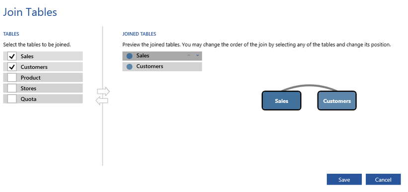
The first step in configuring your chart is to select the Source. The source refers to the table or tables you will need to pull data from to configure the chart to your needs. By selecting the arrow to the right of the field you will be able to choose a single table from your database to be used in your chat configurations. By selecting the venn-diagram button to the right you will be able to select multiple tables you wish to pull data from for your chart. In this example, we've used the Customers and Sales Table from the sample database Adventureworks that is provided with the installation of BI Architect.

Figure 3: Select the Venn - Diagram button to join tables together.

Figure 4: The table "Customers" and "Sales" are selected from the menu.
Dynamic or Static Series Configuration?
Next, let's talk about how you want to structure your chart. Do you want the BI Architect to dynamically generate a new series for every value present in a specific Dimension? The BI Server will group your data accordingly and create a new series for each item. This is called a Dynamic Series. You do have the option to manually configure multiple series, but in the example provided in Figure 1, we have displayed the use of Dynamic Series to display data points for Male and Female. With this example in mind, you will need to now select Switch to Dynamic Series.
Note: Here you will receive a warning to ensure you want to proceed as previous series configurations in the dialog will be lost.
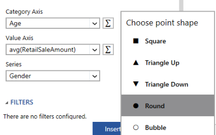
You will now need to select the dimensions and measures to drive your Scatter Chart. Begin with the Category Axis (X) and complete all three configuration steps as highlighted below.
| 1. | Choose the value that will be used for the Category Axis (X). For our example, we've selected the Age dimension as we want our age range to be displayed along the X Axis. |
| 2. | Choose the value that will be used for the Value Axis (Y). For our example, we've created a measure for Average Sale Amount by first selecting the RetailSaleAmount dimension and selecting the Function Button to the right of the field. We have selected a standard function AVG() from this menu, but other advanced options are available to you by selecting Advanced. You can learn more in the Expressions section of the documentation. |
| 3. | Next, you will need to choose the dimension that will be used to create the series dynamically. For this example, we wanted to create a series for every value type found in the Gender dimension. You will need to select the dimension that is applicable to your needs. Our example will provide a new series for each type of gender: male and female. |

Figure 4: The Category Axis, Value Axis, and Series dimension are selected in the Insert Chart dialog.
You can now select the shape to be used when plotting the points in your Scatter Chart. In this example, we've used this option, located to the right of the Series Field, to select the Round choice for point plotting.

Figure 5: The Choose Point Shape menu is available to further customize your Scatter Chart.
Choosing a Filter
Would you like to apply a Local Filter? Here in the Filters Section, you can accomplish just that to add an applied filter to this widget before presenting to your dashboard users. An example of this usage might be if we wanted to filter our chart to only display the ages between 40 and 80. This is, of course, an optional configuration for you. The Insert Chart Dialog will tell you if there are any filters configured for this chart. Let's take a look at what such a Local Filter would look like.
|
|
Figure 6: The Edit Filters dialog allows easy configuration of local widget filters. |
Figure 7: The output only displays the points for the ages between 40 and 80. |
Creating a Caption
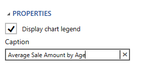
Your final step will be to create a relevant caption for your chart. Simply type your caption in the provided caption field in the Properties Section of the dialog. This caption should tell your users something about the chart and what it is used for. In our example, we've provided a caption stating, "Average Sale Amount by Age".

Figure 8: A Chart Caption is added in the Properties Section.
Related Topics
You may also be interested in the following topics.
Widget Marking - It is important to think about your final dashboard throughout the entire design process. Link widgets through powerful coloring and filter displays in your dashboards using marking.
Aligning and Resizing Dashboard Objects - Lean about organizing and resizing your dashboard objects.
Layout Options - Use the toolbar to control how your chart is displayed in the dashboard when the browser window is resized.
Chart Properties - Format axis values, change borders, and much more.