|
Dynamic Series Charts |


|
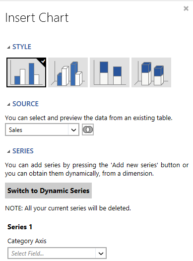
For each Column, Horizontal Bar, or Line Chart you create, you will have two options available to you. You will have an opportunity to either manually create the series to be displayed in your chart or select the option to Switch to Dynamic Series to actually use values within a Field (dimension) to define each series. This useful feature is valuable if you want to create side by side or proportional comparison visually represented in your chart but these series are defined by values in your data. In order to best demonstrate this, let's consider an example.

Figure 1: The Switch to Dynamic Series option in the Insert Chart dialog.
A Useful Example
In order to understand when you may want to use this helpful feature, we'll investigate an example. Let's consider the AdventureworksSales In-Memory Database. Imagine that you want to produce a column chart with the following objectives:
1. You want to show each year as the category axis.
2. You want to show total retail sales on the value axis.
3. You want to show a column bar side by side for each territory value in the territory dimension.
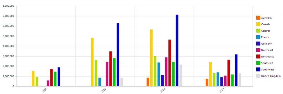
Now, for the third objective, let's imagine the result. On the x axis, we will have a year, say 2001. Above, we'll see a column for every territory value present (a separate series for each). This is exactly the scenario where you would use Switch to Dynamic Series, because the BI Architect will create a series for each value in the Country Dimension.

Figure 2: The BI Architect dynamically creates a series for every value in the "country" dimension.
Usage
If the example above demonstrates the type of data usage that is applicable to you, then you will need to follow these steps. We will use the example above to provide context for the steps.

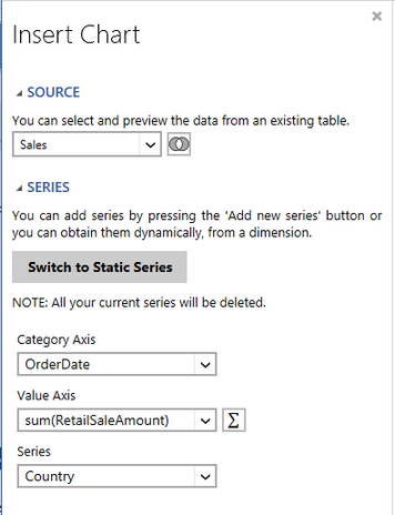
Figure 3: Configuration of chart using Dynamic Series.
Once you have decided that using the Dynamic Series option is the right choice for you, we now need to follow a few steps to configure:
1. Select Switch to Dynamic Series.
Note: You will be warned that you will lose any configurations at this point. You can, additionally, switch back to a static series configuration at any point.
2. Set the Category Axis: The Category Axis will be used to display our grouping category. In this example, we are showing our data grouped per year on the x axis (because this is a column chart, the category axis is on the x axis).
3. Set the Value Axis: You will need to specify the numerical values to use on your Value Axis. In this example we are using the Sum Expression to sum the RetailSaleAmount and then use those values as our y axis.
4. Define the dimension to use for Series creation: You will need to select the dimension whose values will be used to create the series dynamically. In this example, we've selected Country so every country value within will be represented as a different series.
When you have completed the configuration of these three options, you can add a local filter if you would like. When you have successfully completed the configuration of your chart, select Insert to add the chart into the Design Surface.
Related Topics
Using Charts with Dynamic Series - You can view this helpful video to learn how to switch to the Dynamic Series option and configure and insert a chart using Dynamic Series.