|
Widget Marking |


|
When inserting Widgets and other objects into your dashboards, you are meeting the needs of your users by showing powerful visual representations of the data that is driving each Widget. However, it is important to remember that all of your dashboard objects can be related in some capacity and when your dashboard users interact with one Widget, they may want this to be visually marked in another widget or even filter other widgets in the dashboard to only display the content related to the selected item.
Let's take a closer look at an example to demonstrate marking a bit better. We'll use the AdventureworksCustomers.bid dashboard design sample that comes with the installation of the BI Architect. You can follow along with this pre-configured dashboard to assist.
Example:
Figure 1: The dashboard before selection. |
Figure 2: The dashboard after selection. |
Marking Group
As you can see in this dashboard example, marking allows us to see specific information in other widgets related to the selected item. When we select Management Occupation in Sales by Occupation, we can see the other widgets using the same marking group will highlight the values that share this dimension.
By default, visualization widgets like Charts and Tables, have marking enabled. You may wish to unmark certain widgets, or change the Marking Group the widget is in. It is important to note that each Marking Group is denoted by a different color.
Usage
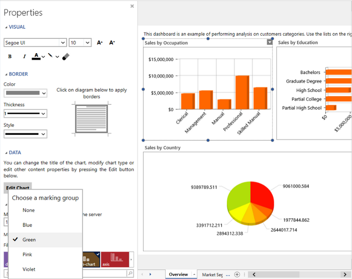
You can access the Marking feature by navigating to Properties Pane for any Visualization Widget. You are able to change the color of the marking group to one of the available options.

Figure 3: The Marking group option is located in the Properties Pane, under the Advanced section.
Let's take a closer look at an example to demonstrate filter by marking a bit better. We'll again use the AdventureworksCustomers.bid dashboard design sample that comes with the installation of the BI Architect. You can follow along with this pre-configured dashboard to assist.
Example:
Figure 4: Details On-Demand is blank before selection. |
Figure 5: Details On-Demand is populated after selection. |
Filter by Marking
You will notice a we have a table widget called Details On-Demand. As you can see, this table will be filtered completely based on the selections made by your users in the dashboard. You now can actually see the detailed transactions related specifically to the selected data.
By default Filter by Marking is not enabled for any widget.
Usage
You can access the Filter by Marking feature by navigating to Properties Pane for any Visualization Widget. You are able to toggle this option off, or change the Marking Group you wish to filter by .

Figure 6: The Filter by marking group option is located in the Properties Pane, under the Advanced section.
Tutorials
Using Widget Marking - In this video you will learn how to add Marking to a widget as well as how to Filter your widgets by Marking.