|
Bubble Charts |


|
Bubble Charts are powerful chart widgets that allow you to display data points in a similar fashion as a Scatter Chart. However, these charts also provide the ability to display a fourth measure visually for size. Not only will a point in your chart represent a value placed in relation to two driving variables, the actual size of the bubble will be a reflection of a measure of your choosing.
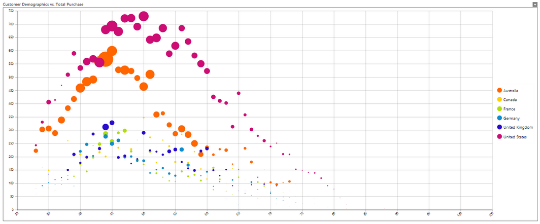
To best demonstrate this concept, let's first take a look at a Bubble Chart example. A world-wide bike equipment and parts store wants to graphically be able to analyze their customer demographics in relation to the total purchase amount for that group. Not only do they want to see a representation of the customer base age trends, but they would also like to see a representation of the amount that was spent. This answers the question, "What age groups are spending the most money, and where?". The following key items are of importance:
| • | The chart should split the data into visually identifiable groups for each country. |
| • | The chart should display the age on the X Axis. |
| • | The chart should display the count of customers on the Y Axis. |
| • | The chart should display the total sales amount reflected in the size of the bubble. |
You can already imagine the comparisons and conclusions that can be made by such a chart before even seeing the visual product. It is important to make a note or a list of items that your users will need and this will help you in driving the configuration of your chart. Let's take a look at how a Bubble Chart looks in a completed dashboard.

Figure 1: A Bubble Chart shows powerful trends through spatial positioning and size.
Notice that the Bubble Chart allows your users to make valuable conclusions with only a quick glance. The power behind this widget is that not only can your dashboard users visualize key trend through spatial position, they can also pick up on powerful visual indicators in series color and bubble size.
Now that you've gained a better understanding of the applicability of Bubble Charts, we can move forward and discuss how to easily integrate these charts into your dashboards.
Access
To learn how to access the Insert Chart dialog please visit the helpful page on Inserting Visualization Widgets for the specific display mode you are using, Mouse or Touch.
Usage
Select a Source
You need to select the Data Source you would like to use to drive your bubble chart. In this step, you will select the table by using the selection menu that will list your available tables. For this example, we are using the sample In-Memory Database Adventureworks that comes with your installation of the BI Architect. We are selecting the Customers table as well as the Sales table to access our demographic information about the customers. By selecting the venn-diagram button to the right you will be able to select multiple tables you with to pull data from for your table.

Figure 2: The Customer and Sales tables are selected.
Dynamic or Static Series Configuration?
Now that you've selected your data, you can proceed with configuring the Series. You can proceed to configure individual series manually as you see fit, but often you will find that you will want the BI Architect to create a new series for every value present in a dimension of your choosing. This is an example of applying Switch To Dynamic Series. Let's take the example as shown in Figure 1. Here, we want a series for every value in the Country dimension. Instead of manually configuring this for every Country value, we'll select Switch To Dynamic Series option and let the BI Architect do this work for us.

Figure 3: The Switch to Dynamic Series button as seen in the Insert Chart Dialog.
Once you've decided on Static or Dynamic series configuration, you can proceed to select the dimensions or measures that will drive your Bubble Chart. Follow the instructions below to complete the configuration options in the Series Section of the Insert Chart Dialog.
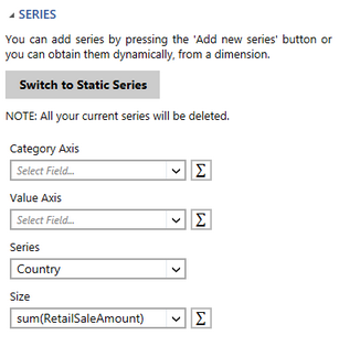
| 1. | Choose the value that will be used for the Category Axis (X). For our example, we've selected the Age dimension as we want our age range to be displayed along the X Axis. |
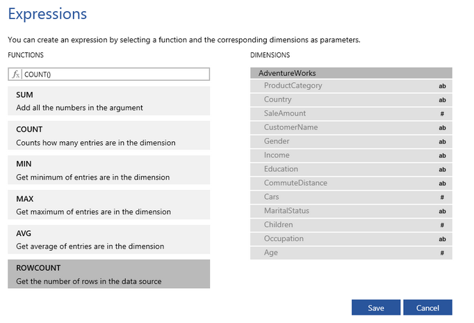
| 2. | Choose the value that will be used for the Value Axis (Y). For our example, we actually want to count the number of customers for each age, so we are going to use the Function Button to create our own Expression as this count is not already located in the sample data source. When selecting the Function Button you will notice that advanced options are available to you by selecting Advanced. You can learn more in the Expressions section of the documentation. For this example, we are going to use the standard function called RowCount which gets the number of rows in the data source. By selecting this option in the Expressions Window, you will notice the function "count()" is used. |

Figure 4: The RowCount Function is selected in the Expressions Window.
3. Next, you will need to choose the dimension that will be used to create the series dynamically. For this example, we wanted to create a series for every value type found in the country dimension. You will need to select the dimension that is applicable to your needs. Our example will provide a new series for each country.
4. Lastly, you will need to specify which measure to use for the Size of the bubbles in your chart. To do so, simply use the drop down menu for the Size field. Remember, this needs to be a calculation for the data represented in your chart, so a measure will be required here. For our example, we want the sum of the RetailSaleAmount. First, select RetailSaleAmount dimension from the drop down menu, then use the Functions Button to select Sum.

Figure 5: The Series Section of the Insert Chart Dialog.
Choosing a Filter
Would you like to apply a Local Filter? Here in the Filters Section, you can accomplish just that to add an applied filter to this widget before presenting to your dashboard users. An example of this usage might be if we wanted to filter our chart to only display the ages between 40 and 60. This is, of course, an optional configuration for you. The Insert Chart Dialog will tell you if there are any filters configured for this chart. Let's take a look at what such a Local Filter would look like.
|
|
Figure 6: A filter is added to the Bubble Chart. |
Figure 7: A Bubble Chart only displays filtered ages between 40 and 60. |
Creating a Caption
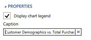
Your final step will be to create a relevant caption for your chart. Simply type your caption in the provided caption field in the Properties Section of the dialog. This caption should tell your dashboard users something about the chart and what it is used for. In our example, we've provided a caption stating, "Customer Graphics vs. Total Purchase".

Figure 8: A Caption is added in the Insert Chart Dialog.
Related Topics
You may also be interested in the following topics.
Widget Marking - It is important to think about your final dashboard throughout the entire design process. Link widgets through powerful coloring and filter displays in your dashboards using marking.
Aligning and Resizing Dashboard Objects - Lean about organizing and resizing your dashboard objects.
Layout Options - Use the toolbar to control how your chart is displayed in the dashboard when the browser window is resized.
Chart Properties - Format axis values, change borders, and much more.