|
Scatter and Bubble Chart Series Options |


|
The series options for both a Scatter or Bubble chart are the same. You will have the ability to edit the color independently for different series.
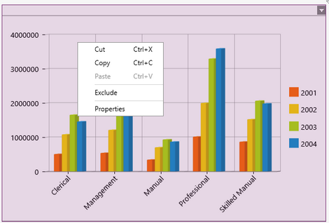
1. Right click on the Chart that you want to open the Properties Pane for.

Figure 1: The contextual menu displayed when right clicking.
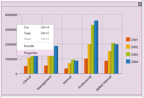
2. From the resulting contextual menu select the Properties option.

Figure 2: The Properties option is highlighted in the contextual menu.
3. Select the Series target object in the Navigation Bar.

Figure 3: The Series target object is selected in the Navigation bar.
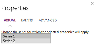
4. Select the Series name you would like to work with.

Figure 1: Select the Series that you want to modify.
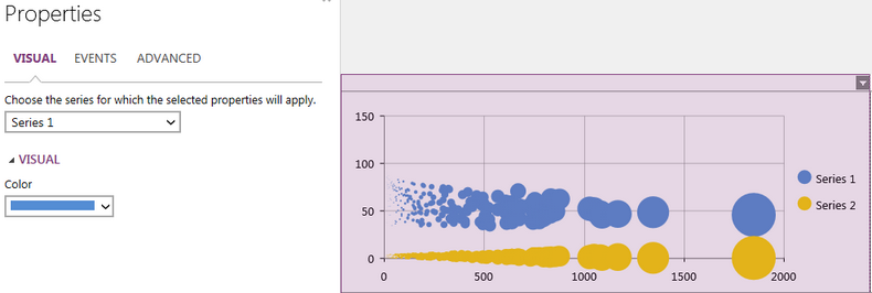
5. Select the color you would like to represent the selected series in the dashboard. You will be able to select from one of the predefined colors or create your own to meet your needs.

Figure 2: The blue Bubble chart displaying the Salesperson's age as seen in Series 1.
Next Steps
Displaying a Scroll-Bar - Learn how to display a scroll-bar in your Chart.
Chart Legend - Learn about the options to edit your Charts legend.
Caption - Learn how to customize the Chart caption to meet your needs.
Widget by Marking - Learn how to use marking to relate your inserted widgets.
Filter by Marking - Learn how to configure your widgets to filter depending on the markings you have set.
Advance Chart Options - Learn about the advance options you can use to customize your chart.
Adding Java Script - Learn how to add javascript to your Charts.