|
Chart Legend |


|
In the BI Architect every chart will, by default, have a legend to display helpful information describing the data presented in your chart. You have several options when it comes to configuring the legend to meet your specific needs.
1. Right click on the Chart that you want to open the Properties Pane for.
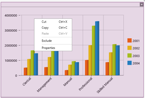
Figure 1: The contextual menu displayed when right clicking.
2. From the resulting contextual menu select the Properties option.
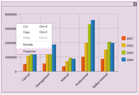
Figure 2: The Properties option is highlighted in the contextual menu.
3. Select the Legend target object in the Navigation Bar.

Figure 3: The Legend target object is selected in the Navigation bar.
4. View the different Chart Legend options has outlined below.
Showing or Hiding the Legend
As stated before, the legend will be shown in your chart widget by default. However you will have the option to hide it.
1. To hide the legend of the selected chart, simply deselect the Display Legend check box.
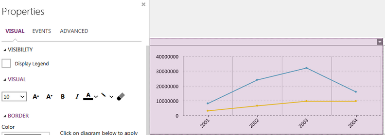
Figure 1: The Chart's legend is hidden.
2. Similarly if the legend has been hidden and you would like to show it, select the Display Legend check box.
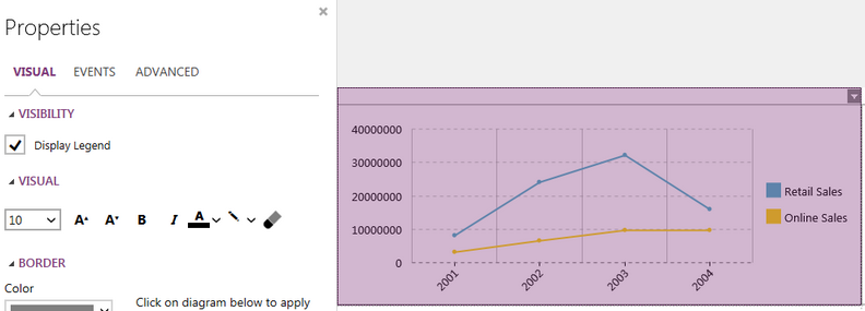
Figure 2: The Chart's legend is displayed for the two Series.
Editing the Text
Here you will be able to edit the text of just the legend, independently of the rest of the chart. You will have similar font options as in changing chart fonts.

Figure 3: The Line Chart after editing the text for the legend.
Adding a Border
You will have the option to add a border directly to the legend, independent of the entire chart.
1. Select the color you would like the boarder to be. Similarly to the color options for chart fonts you will be able to select from one of the predefined colors or create your own to meet your needs.

Figure 4: Change border color.
2. Select how thick you would like to boarder to be in the out put.

Figure 5: Thickness size of 4 was selected.
3. Select the sides of the diagram to indicate where you would like to have borders on your chart.

Figure 6: Borders were added to the whole diagram.
NOTE: When making any changes to the border options (color or thickness) you will need to first deselect then reselect the boarder in the diagram to apply the changes.
Adjusting the Position
By default the legend of any chart will be centered on the right side of the inserted chart. You can easily change this to need your needs.
1. Select the position you would like the legend to be relative to the chart. Right, Left, Top, Bottom.

Figure 7: The legend is positioned at the Bottom of the Chart.
2. Select the horizontal alignment of the legend. Left, Right, Center.
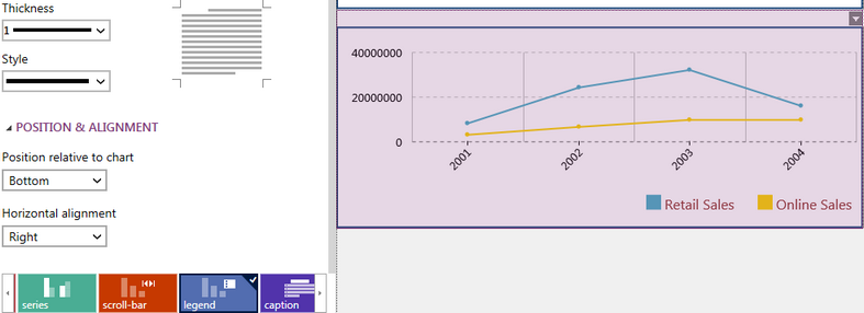
Figure 8: The legend is positioned at the Bottom Right of the Chart.
Next Steps
Caption - Learn how to customize the Chart caption to meet your needs.
Widget by Marking - Learn how to use marking to relate your inserted widgets.
Filter by Marking - Learn how to configure your widgets to filter depending on the markings you have set.
Advance Chart Options - Learn about the advance options you can use to customize your chart.
Adding Java Script - Learn how to add javascript to your Charts.