|
Pie Charts |


|
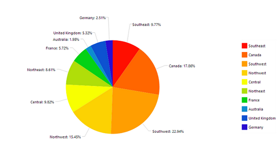
Pie Charts are circular diagrams divided into sectors. These charts are useful when demonstrating proportions. The example below demonstrates the usage of a pie chart to effectively provide a visual representation of the percentage of retail sales by each sales territory.

Figure 1: Pie Chart displaying percentage values with legend.
Access
To learn how to access the Insert Chart dialog please visit the helpful page on Inserting Visualization Widgets for the specific display mode you are using, Mouse or Touch.
Usage
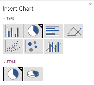
Ecrion BI Architect allows you to choose from two Styles of Pie Charts: 2 dimensional or 3 dimensional.

Figure 2: Pie Chart style options.
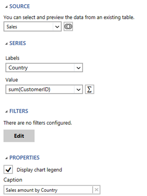
You will need to set up the Pie Chart by specifying the settings in the Dialog Bar as demonstrated below.

Figure 3: Pie Chart dialog bar options.
Select a Source
The first step in configuring your chart is to select the Source. The source refers to the table or table you will need to pull data from to configure the chart to your needs. By selecting the arrow to the right of the field you will be able to choose a single table from your database to be used in your chat configurations. By selecting the venn-diagram button to the right you will be able to select multiple tables you with to pull data from for your table.
In Figure 3 the source that is selected is the Sales table.
Configure the Series
A Pie Chart will accept two primary variables for which we call Labels and Values.
Following the example in Figure 1: This pie chart will display the percentage of total retail sales contributed by each territory.
The Labels are specified with the Country field by selecting the drop down menu.
The Values are specified with the sum of the RetailSaleAmount field by first selecting the field RetailSaleAmount from the drop down menu. Next the Functions Button is selected to choose the Sum function.
Using the Sum function is an example of using an Expression. You can select the Functions Button to insert or build your own Expression.
Choosing a Filter
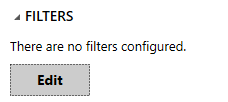
By selecting the edit button in the Filter Option you are able to configure local filters for your widget as you need to meet your specific needs. To do so, select Edit in the Filters options. Visit our helpful section on working with local filters, to learn more.

Figure 7: This filter option is located in the insert chart dialog.
Related Topics
You may also be interested in the following topics.
Widget Marking - It is important to think about your final dashboard throughout the entire design process. Link widgets through powerful coloring and filter displays in your dashboards using marking.
Aligning and Resizing Dashboard Objects - Lean about organizing and resizing your dashboard objects.
Layout Options - Use the toolbar to control how your chart is displayed in the dashboard when the browser window is resized.
Chart Properties - Learn more about additional modifications that can be made to your Pie Chart after inserting in your dashboard.