|
Form Properties |


|
|
Form Properties |
|
Now that you have added Form Elements into your Document Template, you can set specific properties for each to add formatting, dynamic properties, and much more. This help section is designed to assist you in working with the properties associated with each Form Element.
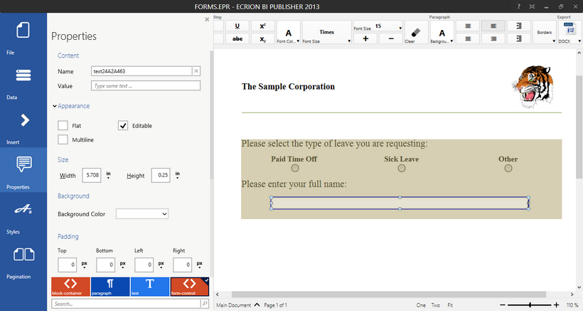
Figure 1: The Properties dialog shows available options for a form element.
Usage
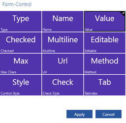
The first step in working with Form Element properties is to select the item you wish to modify in the Design Surface. Next, select Properties in the Side Menu to display the Properties Dialog. You should take note of the element that is selected in the Navigation Bar. The Properties Dialog will refer to your select form feature as the form-control element. Make sure that this item is selected in the Navigation Bar when you making your desired adjustments to this object.
Common Form Properties
Because there are numerous types of Form Elements that you will be working with, you can access this section to learn about common properties that you will have access to changing. These properties can be found in the Properties Dialog for any type of Form Element that you are working with.
Content - You can make adjustments in the Content section related to the both the Name and Value of the Form Element.
The Name is used within your Document Template and is unique to that particular object. By default, the Publisher will assign a value for you, but you can modify this item to meet your needs.
The Value is the actual content that will populate your Form Element. You can leave this blank or provide default static text by typing into this available field.
Appearance - You may wish to make adjustments to the Appearance of the Form Element. In this section, you can adjust the following items by simply selecting the available check box.
The Flat option is available to you add or remove shading affects that visually add depth to the look of your form element.
The Editable option is available to you to specify if you want your readers to be able to modify this form element. This can be useful when you choose to populate this form element with data from your data source.
The Multi line option is available when working with Edit Boxes. This option is useful if you your readers may add large quantities of text in your desired form element. A line break will be used based upon the available width you specify for the size of the edit box.
Size - In addition to manually resizing the form element in the Design Surface, you can also specify exact dimensions here in the Properties Dialog. Simply enter in the desired dimensions for width and height and select the unit you need from the available drop down menus.
Background - You can easily change the background color of a form element by using this option to select your color. Using the drop down menu, you can select the color of your choice to add a customized look to your form.
Padding - You may wish to define padding for a Form Element. Padding defines the space that between your Form Element content and borders. You can easily change these values by manually entering in the numerical value in the field and selecting the unit of your choice from the drop down menu.
Borders - You can add borders to each Form Element by simply using the Borders selection options available to you in this section. For more information on the selection and application of borders, you can visit the Borders help section in Common Tools.
Advanced Options
Submit Buttons - If you have decided to insert a Submit Button into your form, then you may also want to further configure the behavior and resulting actions for them. You can access the advanced configurations of a Submit Button here. These options include specifying the HTTP-URL will be used as the target address and specifying the HTTP Method used. The URL will be specific to your needs, but you will be given the options of POST and GET when choosing your Method. A GET method requests data from a specified resource, whereas a POST method submits data to be processed to a specified resource.
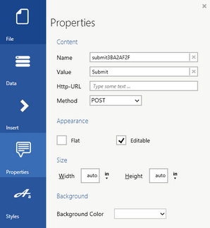
Figure 2: The configuration options for a Submit Button are displayed.
Dynamic Properties - For any of your Form Elements, you can add Dynamic Properties. Dynamic Properties will allow you to change options such as background color, font options, and much more based on values directly from data source or even based upon conditional tests. To use the Dynamic Properties dialog, you can simply select Edit under the Advanced section of the Properties Dialog. You can read about how to accomplish your dynamic property needs by visiting the help documentation section on Dynamic Properties.
Let's take a very commonly used example of using Dynamic Properties in relation to form elements. Perhaps you might need a specific Edit Box to be populated with data from your data source. In this example, you can use the Dynamic Properties Dialog to first select the Value property and then select the field in your data source to assign this from. Below is an image of each of these steps and the included output for this example.
Figure 3: The Value Property is selected. |
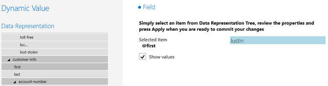
Figure 4: A data source field is selected to obtain the value.
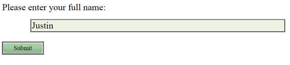
Figure 5: The output displays the Form Element filled in with data from the data source.
When you have completed all of your Form Properties modifications, you can simply select Properties in the Side Menu to hide the Properties Dialog bar.