|
Insert Table |


|
Tables are used to structure information in a row and column format that provides advanced display of data points. The ability to customize columns to display desired data, filter, and sort the results, are all key reasons for including tables in your dashboard.

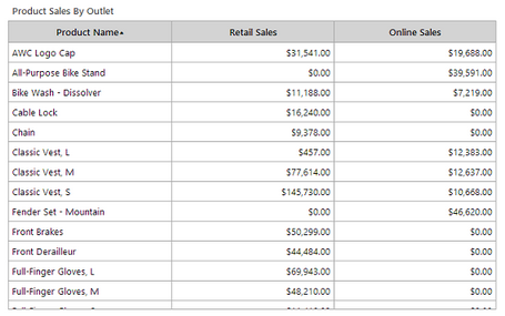
Figure 1: Table example demonstrating three columns with table caption.
This example demonstrates the usage of a table to display a list of products and two additional columns showing the measures (sums) for the sales in both Retail Stores and Internet. Using such a table would allow a user to sort by each column and visually compare the sum measures for every product. For example, if you simply wanted to reference which sales outlet performed better for the Bike Wash - Dissolver product.
Access
To learn how to access the Insert Table dialog please visit the helpful page on Inserting Visualization Widgets for the specific display mode you are using, Mouse or Touch.
Usage
The BI Architect will provide you with the options to add a Title, choose Dynamic Column Widths, and then add Columns according to your needs.
The example below, demonstrates the setup of the table provided in Figure 1.
Figure 2: Configuration for the Source. |
Figure 3: Configuration for Product Column. |
Figure 4: Configuration for Retail Sales Column. |
Figure 5: Configuration for Online Sales column |
For each Column, the configuration is as follows:
| • | Product Name: The Label was manually modified to display "Product Name". Next the Field ProductName was selected from the drop down list of options available, and no formatting was applied. In this example, we've selected to sort by the Product Name. |
Note: You can select to sort the output on particular column by simply selecting the Sort check box.
| • | Retail Sales: The Label was manually modified to display "Retail Sales". Next, the Functions Button was used to select the Sum of the RetailSaleAmount field. Formatting was applied by selecting Currency from the drop down menu as well as selecting the Alignment button and choosing to right align. |
| • | Online Sales: The Label was manually modified to display "Online Sales". Next, the Functions Button was used to select the Sum of the InternetSaleAmount field. Formatting was applied by selecting Currency from the drop down menu as well as selecting the Alignment button and choosing to right align. |
Using the Sum function is an example of using an Expression. You can select the Functions Button to insert or build your own Expression.
Choosing a Filter
By selecting the edit button in the Filter Option you are able to configure local filters for your widget as you need to meet your specific needs. To do so, select Edit in the Filters options. Visit our helpful section on working with local filters, to learn more.

When you are finished setting up your columns to display your desired data, you can select OK and preview your table in the Design Surface.
Further table adjustments can performed in the Table Properties by selecting the table in the Design Surface and then selecting the Properties button in the Side Menu.
Related Topics
You may also be interested in the following topics.
Widget Marking - It is important to think about your final dashboard throughout the entire design process. Link widgets through powerful coloring and filter displays in your dashboards using marking.
Aligning and Resizing Dashboard Objects - Lean about organizing and resizing your dashboard objects.
Inserting a Table Widget - You can view this helpful video tutorial on how it insert and configure your table.
Table Properties - Further table adjustments can performed in the Properties Pane.
Tutorial
Inserting a Table Widget - Here you will learn how to insert and configure a table, as well as how to use the Properties Pane to edit the table.