|
Table Properties |


|
|
Table Properties |
|
In the Properties Dialog you will have access to many modification options when working with your inserted Table. This dialog is useful for making targeted changes to table cells, rows, headers and footers, and the entire Table. In this section you can find helpful information on using the Properties Dialog to make such edits.
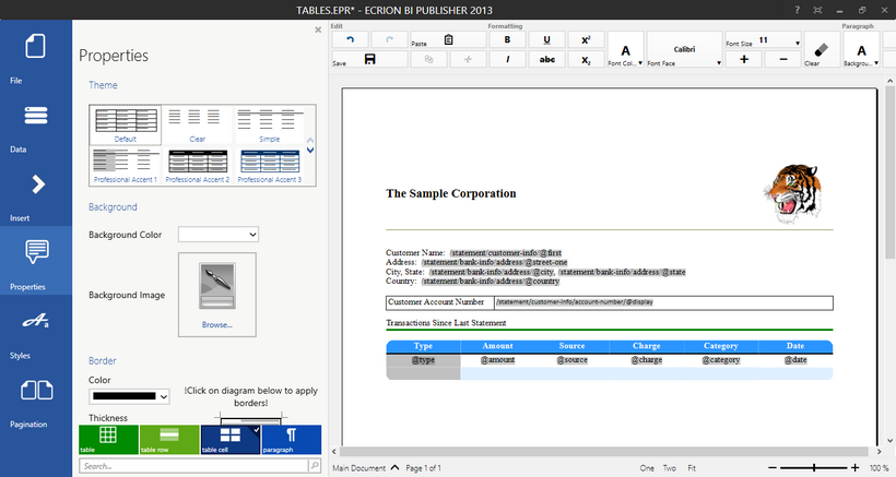
Figure 1: The Properties Dialog is used to make edits to a selected Table.
Usage
You will first need to place your cursor in the Table you would like to modify in the Design Surface. Select Properties from the Side Menu to expand the Properties Dialog. You will notice in the Properties Dialog the available options related to your target element. In the Navigation Bar, you will find that you can select the element of your choice to modify. Here you can change properties for the entire table, a header or footer row, a table row, or for a specific table cell.
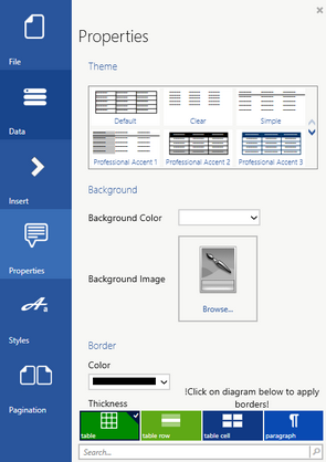
Figure 2: The Properties Dialog shows available properties for modification.
Select the Target Element
You will often want to change specific properties for an entire row or the table cell. In Figure 2, you can see that the Table Element is selected in the Navigation Bar. This will apply adjusted properties to the Table. You will need to make sure you select the correct element to be editing before making any adjustments.
Available Properties
Below you can find commonly used table properties and helpful descriptions.
Theme - You can choose from a variety of predefined themes in the Publisher. Simply use the toggle arrows at the right of the menu and select the theme of your choosing to apply in the Design Surface. This is useful when you do not want to format your own table or perhaps you would like to use Clear formatting to insert a table just for aligning content in your Document Template.
Background - If you would like to change the background color of your target element, select a color from the color selection menu. You can also choose to add a background image by selecting Browse and navigating to select the appropriate image. These properties are useful for highlighting specific rows or cells in your table visually.
Border - This is a very commonly used menu when working with Tables. You can easily select the border style, thickness, and color and apply in the preview diagram by selecting the region to apply to. This is often useful when you need to add or remove borders between columns and rows. You can learn more about working with this common tool in the Borders section of the help documentation. You should also be aware that you can make border modifications in the Toolbar for quick access.
Size - If you would like to modify the row height or the columns width, you can manually enter in your preferred dimensions here. You can also use the drop down menus for these fields to select the appropriate unit of your choice. You can also make this modification directly in the Design Surface by placing your cursor over the border until the double arrow indicator indicates you can select and drag to resize accordingly.
Alignment - You can use this property to change the alignment of cells in your table. You can select from the available options and notice that the alignment will be adjusted in the Design Surface. This is a useful property for making adjustments like moving currency values in your table to use right alignment.
Cell Margins - If you would like to add padding between the cell borders and the content within, you can use the top, bottom, left, and right margin options to add accordingly. Simply manually add the values and select the unit you would like to use to apply. You will notice the adjustments will be reflect in the Design Surface. This will be useful when you want to add space to ensure your content doesn't appear too close to your borders.
Advanced - You can assign these properties to come directly from your data source or even use conditions based on your data to assign properties. In this section you can select Edit to launch the Dynamic Properties dialog. This useful dialog will allow you to set such properties dynamically. An example of such a usage would be if you wanted to change the background color of a cell if the value within exceeds a certain limit. This would highlight this cell visually for your readers and would be entirely dynamic based upon the data. Make sure to read the help section on Dynamic Properties to see useful examples on using this dialog.
A Usage Example
In the example below, you can notice that the Properties Dialog has been used to change the bottom border of the table-row element to yellow and the background color has been modified to be blue. Notice that the table-row element is selected in the Navigation Bar to make these changes to the entire table row.
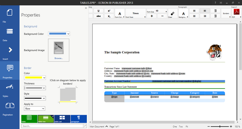
Figure 3: The Properties Dialog is used to make border and background color edits.