|
Responsive Documents |


|
|
Responsive Documents |
|
With the Ecrion Design Studio you are able to adjust sections in your templates to be responsive depending on the device that it will be viewed on. Below is a list of options available, along with the steps needed to configure them. For each of the different device output options, Phone, Tablet, Computer, we have assigned a different stylesheet in order to better help distinguish between them.
Responsive Tables
1. Select anywhere in the table you which to make responsive.
2. In the Ribbon, navigate to the Home tab.
3. From the Style group select the Responsive Design button.
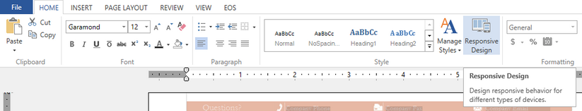
Figure 1: The Responsive Design button is highlighted in the Home Tab.
4. In the Responsive Design dialog select the device type to adjust the settings for; Phone, Tablet, Laptop, or TV.
5. Select one of the available Responsive Table Behaviors; Not Visible, Transpose Columns or Selective Columns.
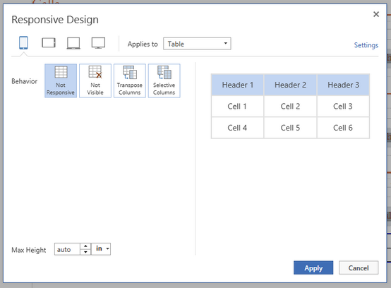
Figure 2: The table options as shown in the Responsive Design Dialog.
Responsive Paragraphs
1. Select in Paragraph to be made Responsive.
2. In the Ribbon navigate to the Home tab.
3. From the Style group select the Responsive Design button.
Figure 3: The Responsive Design button is highlighted in the Home Tab.
3. In the Responsive Design dialog select the device type to adjust the settings for; Phone, Tablet, Laptop, or TV.
4. Select one of the available Responsive Table Behaviors; Not Visible or Show Summary.
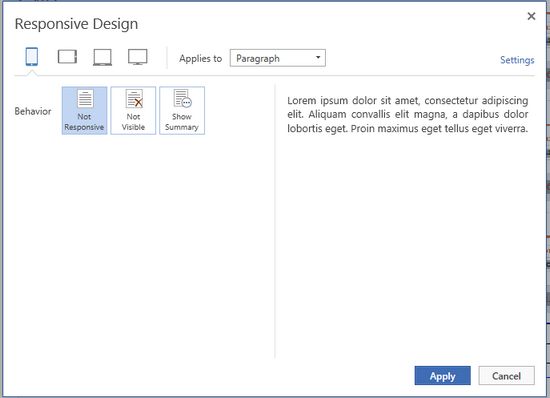
Figure 4: The Paragraph options as shown in the Responsive Design Dialog.
Responsive Grids
1. Select anywhere in the Grid you which to make responsive.
2. In the Ribbon, navigate to the Home tab.
3. From the Style group select the Responsive Design button.
Figure 5: The Responsive Design button is highlighted in the Home Tab.
4. In the Responsive Design dialog select the device type to adjust the settings for; Phone, Tablet, Laptop, or TV.
5. Select one of the available Responsive Grid Behaviors; Not Visible, Drop Column or Selective Columns.
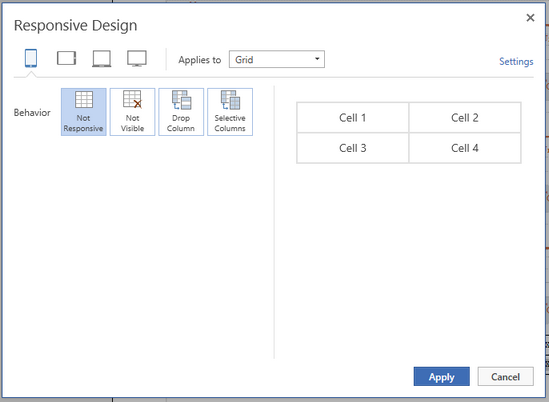
Figure 6: The grid options as shown in the Responsive Design Dialog.
Preview the Output
1. Navigate to the Home tab and select the Preview as HTML5 option from the Export group.
2. This will launch a new tab in your default browser. The view will change depending on the size of the browser window. In order to view what your output will look like on different devices, you will need to resize the browser window.
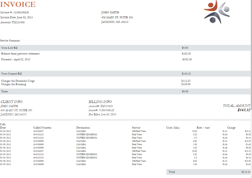
Figure 7: The above image is a snapshot of what the document looks like normally as a HTML5 output.
|
|
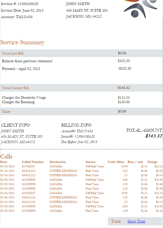
Figure 8: We have added the Summary option to the Total Price of the table.
|
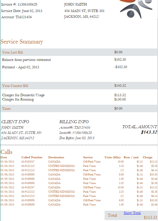
Figure 9: The above snapshot shows what the document will look like when she Show Total option is selected. |