|
Map Charts |


|
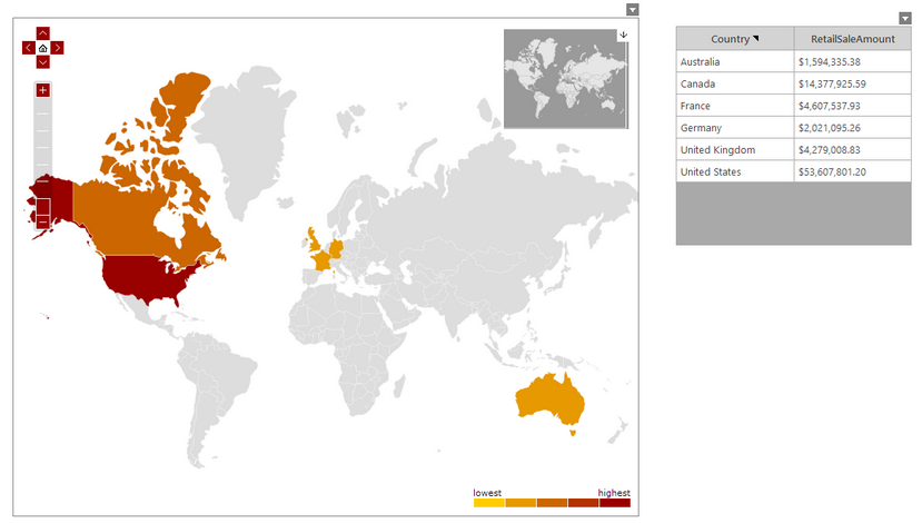
Map Charts can be used in order to represent information in an interactive, geographical representation. The example below demonstrates the usage of a map chart to effectively provide a visual representation of the retail sales by each sales country.

Figure 1: Map Chart visually displaying the retail sales amount for each country.
Access
To learn how to access the Insert Map Chart dialog please visit the helpful page on Inserting Visualization Widgets for the specific display mode you are using, Mouse or Touch.
Usage
The BI Architect allows you to choose from two styles of Map Chart: Areas and Points

Figure 2: Map Chart styles.
Related Topics
You may also be interested in the following topics.
Widget Marking - It is important to think about your final dashboard throughout the entire design process. Link widgets through powerful coloring and filter displays in your dashboards using marking.
Aligning and Resizing Dashboard Objects - Lean about organizing and resizing your dashboard objects.