|
Creating a Line Chart With Multiple Series |


|
|
Creating a Line Chart With Multiple Series |
|
Charts such as Bar Charts and Line Charts are valuable for displaying multiple series of data in a comparative fashion. The instructions below highlight how to set up a Line Chart displaying multiple series of data.
1. For this example you will need to configure the multiple series that you wish to have present in your chart. You will first need to understand where your data points reside. In this example, as highlighted in Figure 1, the data resides in three series with a defining attribute of "month" for each series. We will need to set up a series for each of these months as follows.
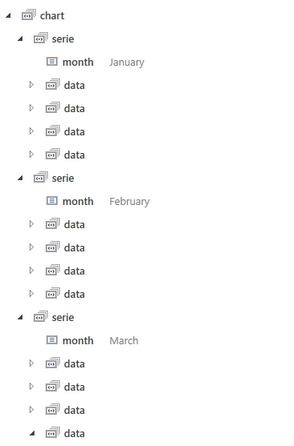
Figure 1: The different series have a defining attribute called month that will be used.
2. Select the Chart button, located in the Insert Tab of the Ribbon and select the Line Chart from the Type Menu.
3. You will need to configure the first series. To begin, select the Select button to launch the Dynamic Value Dialog. Here you can choose a value directly from the Data Tree or select Create Expression to manually create your own XPath Expression. For this example, we will use a predicate to filter the serie element to only select the occurrence when the "month" attribute is equal to "April". Select Save when your configurations are complete.
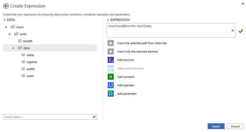
Figure 2: The Expression is created in the Create Expression Dialog to obtain only the series with month attribute equal to April.
4. Repeat this process to select the data point to be used for the category axis (X axis) and the value axis (Y axis). When you are finished, all selected data points will be visible for this series. You can select the Edit button for the series to provide a more applicable name or move up and down accordingly using the arrow buttons. Notice in Figure 4 we have renamed the series to represent April data points.
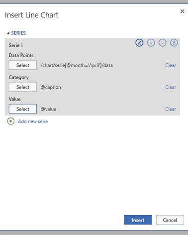
Figure 3: All selected data points are listed and the series is renamed to April.
5. Select Add New Serie to configure a new series. In our example, we will repeat steps 3 and 4 above being sure to change the filter for Data Points to pull the data from the months February and March accordingly. After this process, all three series should be present.
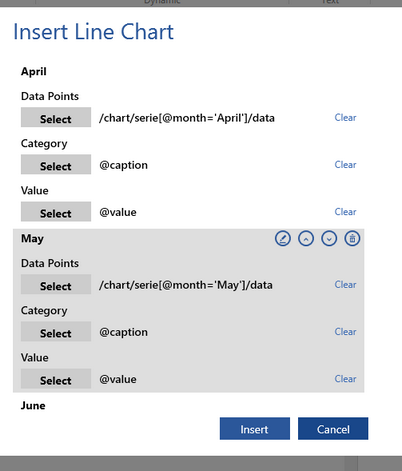
Figure 4: All three series are present in the Insert Line Chart Dialog.
6. When you are satisfied with all of your series configurations, select Insert. The chart will now be inserted into the Design Surface. You will notice that each series is represented as a different colored line as well as a contextual Format Tab is available in the Ribbon when the chart is selected.
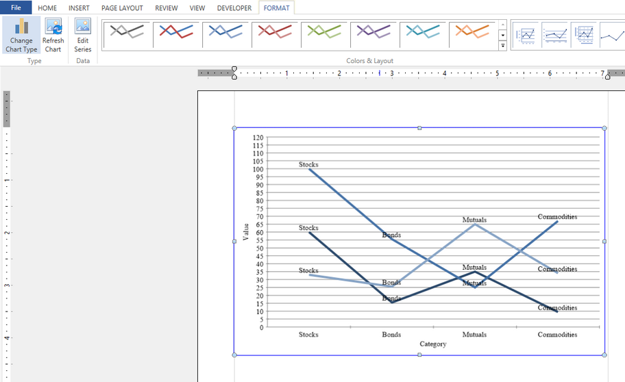
Figure 5: The chart is inserted into the Design Surface and a contextual tab to edit is presented in the Ribbon.
7. You can learn more about additional chart options by visiting the Chart Options section of the documentation.