|
Modifying Axis |


|
|
Modifying Axis |
|
When working with charts possessing Value and Category Axis, there are many options available to you to modify. To edit your axis, follow the steps provided below.
1. Double click on your chart in the Design Surface to launch the Properties Pane.
2. Select the Layout Menu at the top of the pane.
3. Navigate to and select either the Category (X) or Value (Y) axis in the area selection menu.
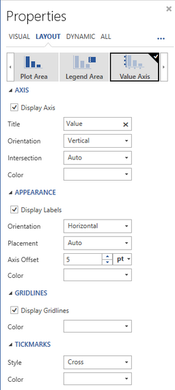
Figure 1: The Value axis is selected in the area selection menu.
4. In the Axis Group you can configure the following options:
| • | Select Display Axis to show or hide the entire axis selected. |
| • | Provide a Title by manually typing in your text. The title will be displayed in the chart. |
| • | Select from orientation menu Vertical or Horizontal to change the orientation of the chart. |
| • | Select an Intersection Value of auto, min, or max for axis placement. |
| • | Select a Color for axis grid lines display. |
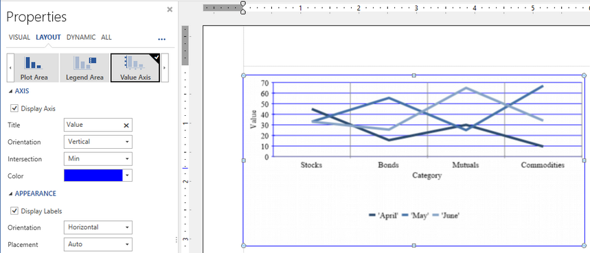
Figure 2: Adjustments are made to the Value Axis.
5. In the Labels Group you can control formatting for the labels of the axis including:
| • | Choose Display Labels to toggle axis labels on or off. |
| • | Choose Placement Value using the drop down menu to center, place between, or set to auto. |
| • | Specify an Axis offset for labels to start that distance from axis. |
| • | Specify a Color for axis labels by selecting the color menu. |
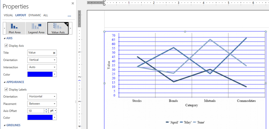
Figure 3: Label offset and coloring are added to the chart.
6. In the Gridlines and Tickmarks Groups you can modify options including:
| • | Selecting Display Gridlines to enable or disable gridlines. |
| • | Choose a color for the gridlines using the Color selection menu. |
| • | For axis tickmarks, choose a style provided from available Options Menu. |
| • | For axis tickmarks, select a color for your tickmarks using the Color selection menu. |
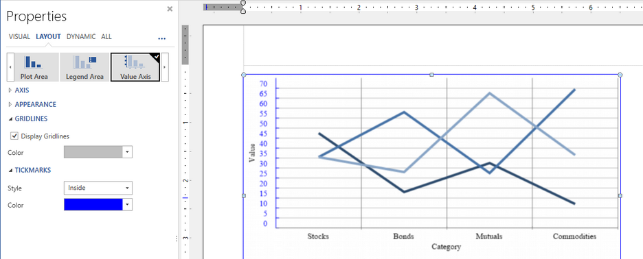
Figure 4: The Gridlines and Tickmarks are formatted for the chart.