|
Text Properties |


|
The Properties Pane can be used to make basic modifications to inserted text in your dashboard.

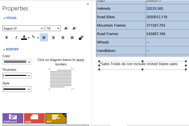
Figure 1: The Properties Pane for text objects in a dashboard.
Access:
For information on how to access the Properties Pane please view the helpful Working With the Properties Pane pages for the specific display mode you are using: Mouse Display or Touch Display.
Usage:
Now in the Properties Pane you can access modifiable properties related to target objects selected in the Navigation Bar. Figure 1 above displays the selection of the text box in the Design Surface as well as the selection of the text element in the Navigation Bar.

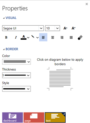
Figure 2: Properties available for text
The properties available to you in for Text Properties are briefly listed below. These often help you make text more visible to highlight particular objects in your dashboard. Notice in Figure 2 above that the text element is selected in the Navigation Bar to show the properties related to that element.
You can select from a variety of visual modifications from the Visual options. Such changes such as changing the font, font size, background color and more can be accessed here.
You can add borders and make appearance modifications for them by using the Border options available in the Properties Pane. Simply select the color, thickness, and style of your choice, and in the border preview image select where you would like to apply the borders.
Important Properties:

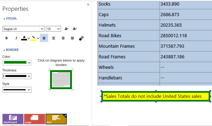
Figure 3: Text properties modified to add dashboard emphasis
Figure 3 demonstrates the usage of Text Properties to change the background color, change the font size, and add borders to the text widget in the dashboard. Below are steps to replicate such an example.
In the Visual options you can select the Background Color button and select from a variety of colors. In this example, we have used yellow.
Also in the Visual options you can select the Increase Font Size button to incrementally increase the font size to 12.
In the Borders options, simply select the border color of your choice (in this example green), the thickness, and the style for the border. Then use the border preview image at the right to click and apply borders accordingly. You will notice the preview image and Design Surface will reflect these borders.