|
How to Insert a Map Chart |


|
When working with Map Charts, you will first need to select which style you would like your map to be. The different chart types have slightly different configurations, which have been highlighted below.
1. Navigate to the Insert Tab in the ribbon.
2. In the Visualization group select the Map Chart button.
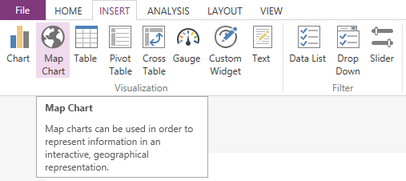
Figure 1: The Map Chart button is selected.
3. View the configuration options for the different Map Charts below.
Areas
1. From the drop down list select the Map you would like to have in your dashboard. You can select from many counties, or World options.
2. You will now need to select the Regions of that will be highlighted in you map from the list of available fields in your data base.
3. Select the Value that you would like to have your Map show per region.
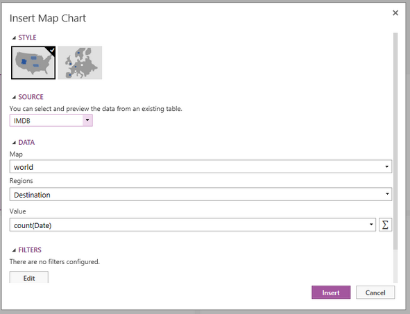
Figure 2: The sum of the Retail sales was selected for the value of map.
4. If needed you can change the function of the value to any of the available options or add a custom function by selecting the summation button.
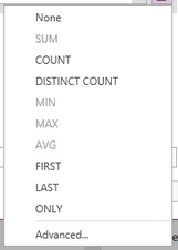
Figure 3: The list of available function types.
5. Once you have configured all of your series all of your Chart, you may need to apply a local filter to your data. Visit this helpful page to learn more about applying a local filter.
6. You are able to enter a Caption for the Chart in the Properties section if needed.

Figure 4: A caption was added to the map.
7. Once you have configured the data and filters select Insert and the Map Chart will be inserted in to the design surface.
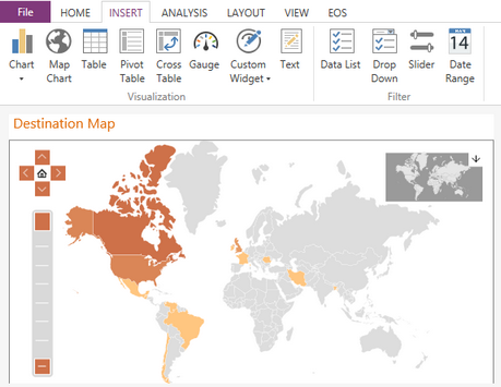
Figure 5: The resulting map in the design surface.
Points
1. From the drop down list select the Map you would like to have in your dashboard. You can select from many counties, or World options.
2. You will now need to select the Points of that will be highlighted in you map from the list of available fields in your data base.
3. Select the value that you would like to have your Map show pre region.
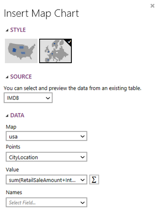
Figure 13: The value was set to be the sum of the retail and internet sales using the custom function button.
4. If needed you can change the function of the value to any of the available options or add a custom function by selecting the summation button.
5. Select the field that you would like to use for the names of each point in the map. You will not be able to see these in the design surface, you will need to preview your dashboard in order to view.
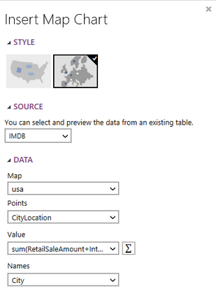
Figure 14: The names of the Cities will be used for the names in the map.
6. Once you have configured all of your series all of your Chart, you may need to apply a local filter to your data. Visit this helpful page to learn more about applying a local filter.
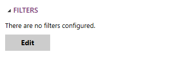
Figure 15: The edit filter button in the Insert Chart Dialog.
7. You are able to enter a Caption for the Chart in the Properties section if needed.

Figure 16: A caption was added to the map.
8. Once you have configured the data and filters select Insert and the Map Chart will be inserted in to the design surface.
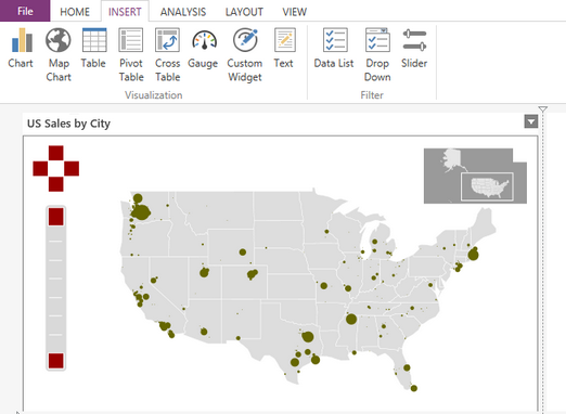
Figure 17: The resulting map in the design surface.
Next Steps
Map Chart Properties- Learn about how to edit and customize your chart after inserting it into the design surface.
Include or Exclude Widgets - Learn how to exclude widgets from your dashboard without deleting it all together.
Resizing Widgets - Learn how to resize your widgets in the design surface.
Repositioning Widgets - Lean how to reposition your widgets after inserting into the design surface.