|
Combination Chart |


|
1. Select the Field that you want to be presented on the Category Axis ( X-Axis) from the drop down list of available fields.
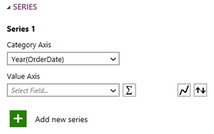
Figure 1: The year was selected for the category axis.
2. Select the Field that you want to be presented on the Value Axis ( Y-Axis) from the drop down list of available fields.
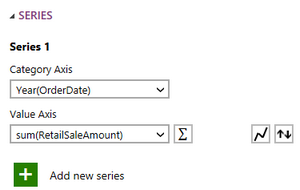
Figure 2: The sum of the retail sales was used for the value of the chart.
3. If needed change the function of the Value Axis by selecting the summation button.
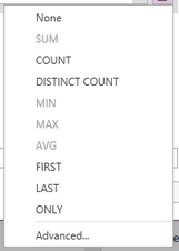
Figure 3: The list of available function types.
4. Select which Line Type you would like to use for this series.
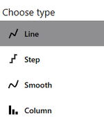
Figure 4: The options for the line type.
5. Select the Rename button to give your series a relevant name.
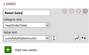
Figure 5: The series was renamed.
6. Repeat these steps(1-5) to create as many series as you need for the chart you are creating.
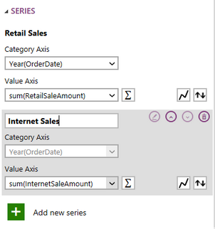
Figure 6: A second series was added for internet sales.
7. Once you have configured all of your series all of your Chart, you may need to apply a local filter to your data. Visit this helpful page to learn more about applying a local filter.
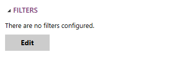
Figure 7: The edit filter button in the Insert Chart Dialog.
8. You are able to enter a Caption for the Chart in the Properties section if needed.
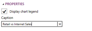
Figure 8: A caption was given to the chart.
9. Once you have set up all the necessary series select Insert and the chart will be inserted in to the design surface.
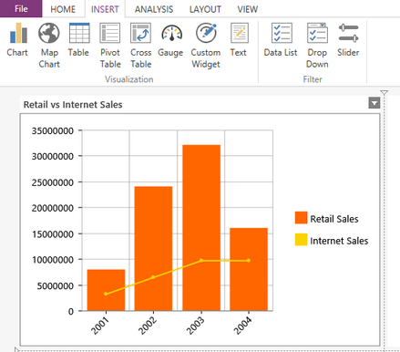
Figure 9: The resulting Chart in the design surface.
Next Steps
Chart Properties - Learn about how to edit and customize your chart after inserting it into the design surface.
Include or Exclude Widgets - Learn how to exclude widgets from your dashboard without deleting it all together.
Resizing Widgets - Learn how to resize your widgets in the design surface.
Repositioning Widgets - Lean how to reposition your widgets after inserting into the design surface.