|
Forms |


|
|
Forms |
|
Overview: XF Designer 2013 allows creating forms for usage in output formats that support them (like PDF and HTML).
Accessing: To create a form, the Forms tab must be used. Firstly, the Form button located in the Controls group must be selected.
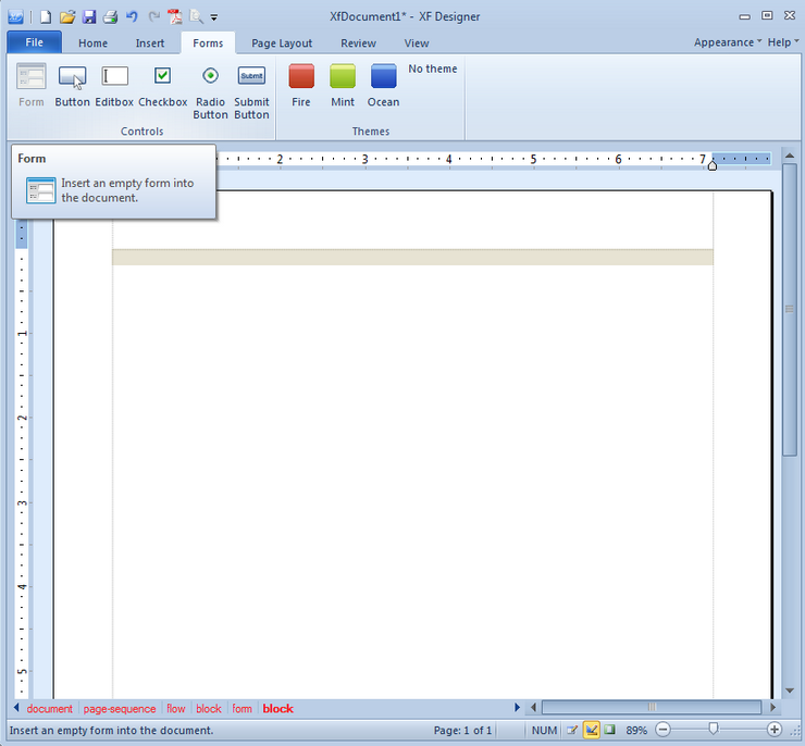
To add a form control object, the user must just select the corresponding button and the respective control will be inserted at the current cursor position.
A form control object cannot be added if the form is not previously inserted by selecting the Form button.
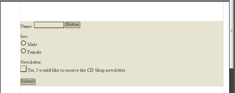
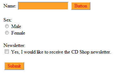
Below is a form with different form control object inserted. Also, the Fire predefined theme was applied for the respective objects.
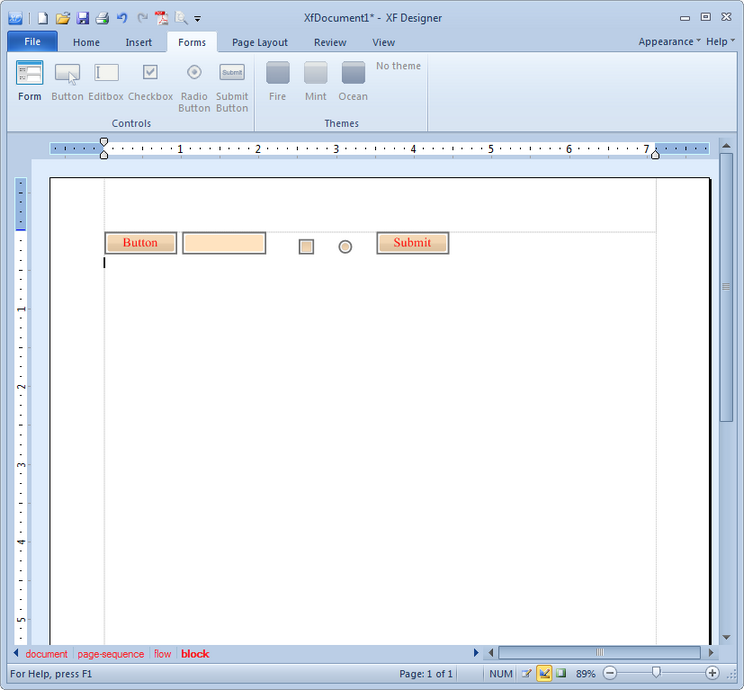
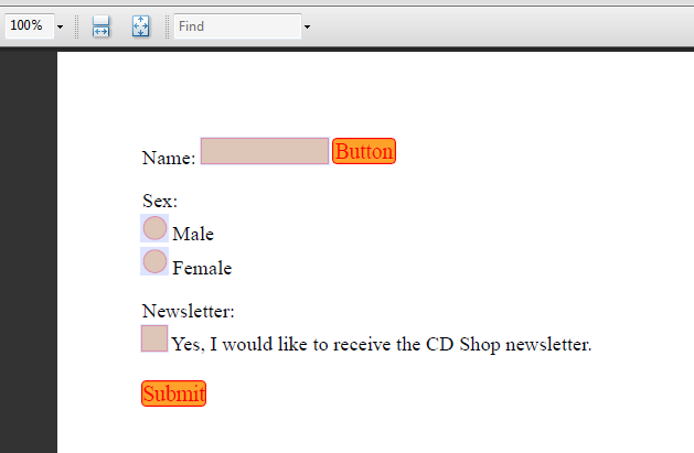
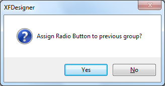
A button, an editbox, a checkbox, a radio button and a submit button have been inserted. If another radio button is inserted it can be assigned to the previous group of form control objects. A dialog box where the user is asked if the radio button should be assigned to the previous group will be displayed.
In Design View the form is highlighted in a light brown color.
A form example can be seen below.
To edit the controls, the user must double click on each one and the Edit Form Control dialog will be displayed.
Depending on the type of the control, some options will be available and other will be grayed out.
The Name option represents the actual name of the control. It's used to identify which value came from which control after the form is submitted.
The Value option represents the value that will be posted when the form is submitted. In the case of checkboxes and radio buttons, it will only be posted if the control is checked. In the case of editboxes, it also represents the default text in the box. In the case of buttons and submit buttons, it's also visible as the caption.
The Http-URL option represents the address to which the form is to be submitted.
The Method option only applies to the submit buttons; it specifies whether to submit via POST or via GET. Both are available in HTML, but only POST is available in PDF.
The Checked option only applies to checkboxes and radio buttons; it specifies whether to check some of the controls in advance.
The Multiline option only applies to editboxes and specifies whether the text is single-line or multi-line.
The Editable option sets a control to be editable.
The Flat option removes all visual effects and the result is a plain form object.
The Borders and Background option allow the user to customize the form control object by setting the desired attributes.
The Events group allows assigning Javascript code to certain events on each control (mouse up/down, mouse enter/exit, focus/blur).
Notes:
| • | Changing the name of a radio button assigns it to a different group. To keep radio buttons in the same group the user must change the name of each radio button. |
| • | If the same Value is assigned to two or more radio buttons which belong to the same group, when clicking one button, they will both be checked. |
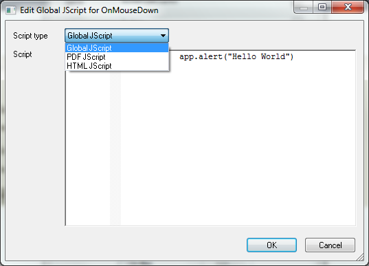
Below, there is an example on how to use the Events option.
To edit the code for an event, the event must be selected and then the Edit button clicked. In this case, a button will display an alert saying Hello World when the OnMouseDown event occurs.
The Edit Javascript dialog will be displayed for the specified event:
 .
.
Here, the user can write or paste the script and select the Script type. This allows the user to write different code for different output formats, since Javascript isn't 100% the same for each format (for instance, in PDF the user needs to use app.alert(), while in HTML alert() must be used for raising an alert window):
| • | The Global Javascript is exported to all output formats for which there isn't any custom code declared. |
| • | The PDF Javascript is exported only to PDF; if this exists, then the code in Global Javascript is skipped for PDF. |
| • | The HTML Javascript is exported only to HTML; if this exists, then the code in Global Javascript is skipped for HTML. |
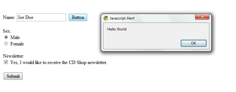
In this case, the app.alert("Hello World") will be added to the PDF Javascript group and alert("Hello World") to the HTML Javascript group.
Below the result displayed in HTML can be seen. Pressing the button pops up the "Hello World" alert window:
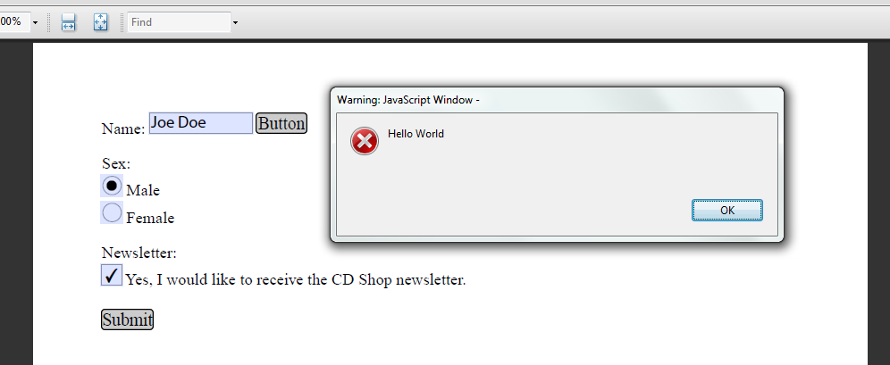
Below the result displayed in PDF can be seen. Pressing the button pops up the "Hello World" alert window:
Note:
| • | To be able to manipulate form controls via Javascript - for instance pressing a button to reset some fields - the user needs to assign an ID to the objects via the Properties dialog bar. |
Forms can also be themed using XF Designer 2013. Just selecting on one of the available themes will apply it to all the available form control objects.
In the example below, the Fire theme is used:
HTML:
PDF: